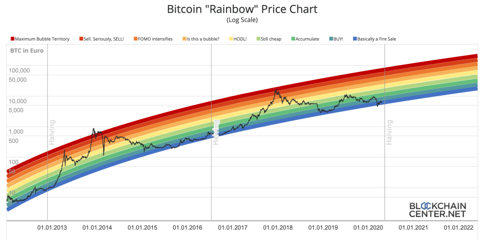
With Bitcoin’s halving less than one month away, investors are losing faith in the stock-to-flow model they’ve long subscribed to that suggests that the asset’s price should be pacing closer to $55,000. Recently, however, a long-time chart shared amongst the Reddit Bitcoin Market’s community has reemerged and given investors hope.
Now, the two charts have been combined for what may be the most important Bitcoin price chart crypto investors ever lay their eyes upon.
Cryptocurrency Faithfuls Lose Hope in Aging Stock-to-Flow Model
Bitcoin price is currently trading at $6,800, up over $3,000 from the low set last month during the extreme panic selloff that took down stocks, gold, and nearly every other asset under the sun.
With a black swan event like the coronavirus currently sending the globe into an economic downward spiral, cryptocurrencies like Bitcoin are facing their most dangerous situation yet.
RELATED READING | OMINOUS BITCOIN PRICE FRACTAL REVEALS REPEAT OF RECORD SELLOFF
These conditions severely tarnish the previously confident view that Bitcoin’s upcoming halving would be a bullish kick start to the next major rally toward a new all-time high, due to the effect the pre-coded event has on supply and demand.
One of the asset’s most widely discussed and cited valuation models, the stock-to-flow model popularized by PlanB, has suddenly become the subject of ridicule, as the first-ever cryptocurrency trades nowhere close to the $55,000 by May 2020 that the model had been predicting.
Instead, Bitcoin price is barely over 10% of that lofty price prediction.

Source: BlockchainCenter.net
Re-Modeling Bitcoin Price Trajectory By Combining S2F With Reddit Rainbow Chart
Bitcoin’s halving does indeed reduce the supply BTC miners receive for validating the blockchain. The idea is that with the sudden drop in supply, the cost of production doubles overnight, prompting miners to cease selling at a loss. The lack of supply entering the market causes demand to outweigh what’s available to be bought, causing prices to spike.
But once Bitcoin price plummeted to $3,800 last month, the hope for that scenario went out the window.
However, an old chart circulating around the r/BitcoinMarkets sub-Reddit since 2014 has reemerged and could bring some much-needed hope to the crypto community. The chart is called the Reddit Rainbow chart, and it has recently been used to challenge the stock-to-flow model as the ultimate tool for tracking Bitcoin’s price.
buy bitcoin 🌈
(h/t @ercwl) pic.twitter.com/sOIH2beGVW
— PlanB (@100trillionUSD) April 20, 2020
The chart simply uses colored rainbow ranges to track Bitcoin’s peaks and troughs throughout the years. The chart caught on with such traction, that the creator of the stock-to-flow model has combined the charts to form the ultimate in crypto chart collaborations.
RELATED READING | DIAMONDS ARE FOREVER: BITCOIN AND XRP JUST FORMED AN ULTRA-RARE BOTTOM PATTERN
The new, stock-to-flow rainbow chart uses the colored bands to indicate support or resistance on the stock-to-flow model’s expected trajectory for Bitcoin’s price based on the asset’s scarcity.
Will the new stock-to-flow rainbow chart accurately predict what’s next for Bitcoin price?
Featured image from Pixabay


